Taelor
Product and marketing design for a menswear rental startup: the stylist pages on the website, a gift card flow in the warehouse tool, and what a customer sees when the box arrives.
[Live stylist page link]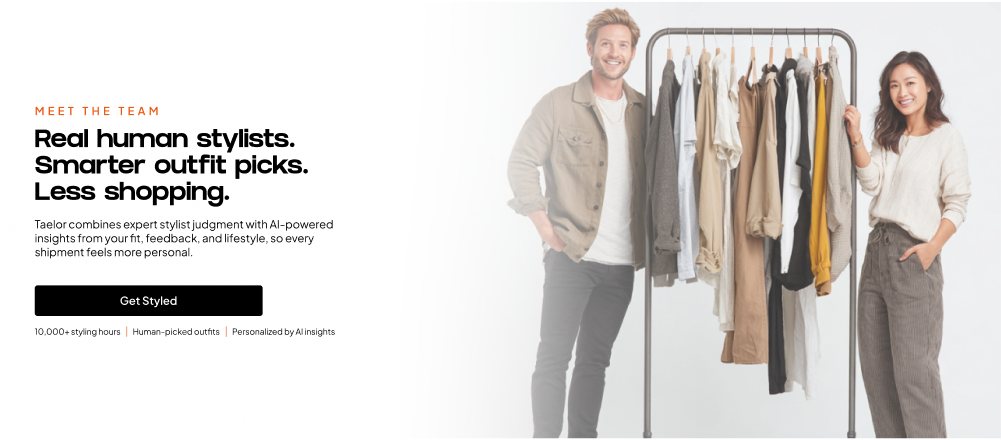
1. Overview
One designer across website, operations and marketing
Taelor is a menswear rental subscription that pairs human stylists with AI. As the only designer on a small team, I worked on every place a customer or a warehouse worker meets the brand.
2. Problem
A growing service whose touchpoints did not match
For customers
- The stylist page opened with a long biography before any proof.
- Too many words, and fonts and images that did not fit the brand.
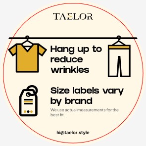
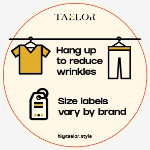
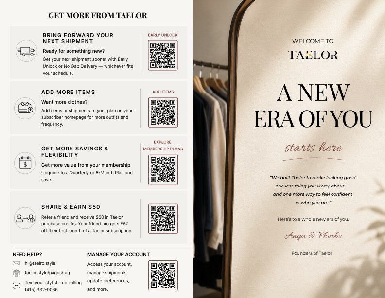
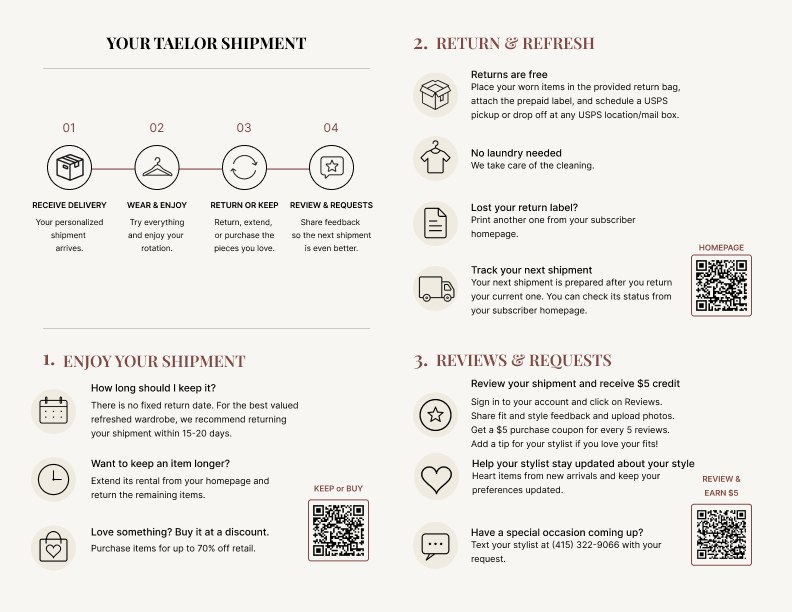
- The packing sticker and new customer flyer were wordy and off-style.
For the warehouse
- Physical gift cards had no flow in the operations tool.
- Two machines could start picking the same order.
- Missing and in-repair items were tracked on sticky notes.
3. Research
I started by being a customer
- Signed up and used the service
- Learned the website and the operations tool
- Interviewed other interns about onboarding
- Wrote up every issue, ranked by risk
What I found, in priority order
| Priority | Problem | Proposed fix |
|---|---|---|
| Critical | Two machines can start the same order, which risks duplicate picking and wrong shipments. | Show "In progress" before Start is pressed, and lock the order to one machine. |
| High | Pick lists are not in rack order, so pickers walk back and forth on every order. | Sort the list by rack position. |
| Foundational | Racks are numbered with no logic, so one clothing type is scattered. | A letter for the category plus a number, like A01 or B01. |
| Hygiene | Missing and in-repair items are tracked on sticky notes. | A status tag on the item in the system. |
| Polish | The packing sticker and new customer flyer are wordy and off-brand. | Fewer words, one style, more visuals. |
4. Solution
Three places people meet the brand
Website
Stylist pages, redesigned for trust
- The call to action moved to the top: "Get matched with a stylist".
- Real customer quotes, with name and date, sit under each look.
- The biography moved down and got shorter.
- Previous and next links let visitors browse all ten stylists.
Before
After
Team page
Phone
Open any screen to see it larger. Built with the engineer for desktop and phone.
Operations tool
A gift card flow, from zero to in use
- Mapped how a physical gift card is picked, packed and shipped.
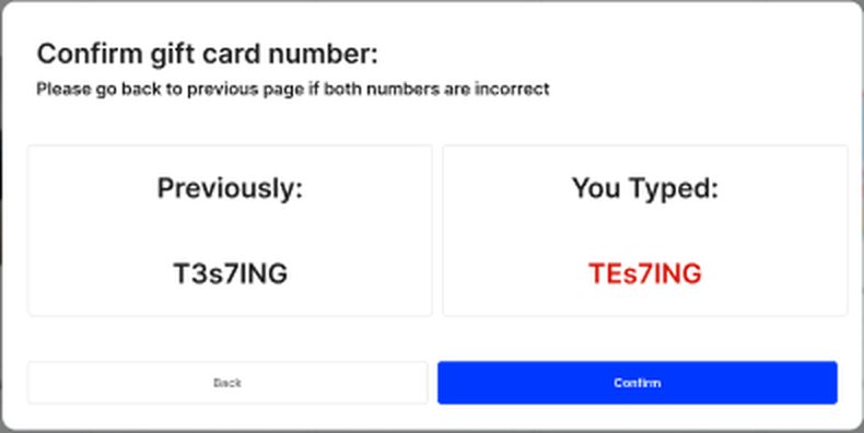
- The picker types the card number on a phone. The packer types it again on the computer.
- If the two numbers differ, the tool shows both and highlights the difference.
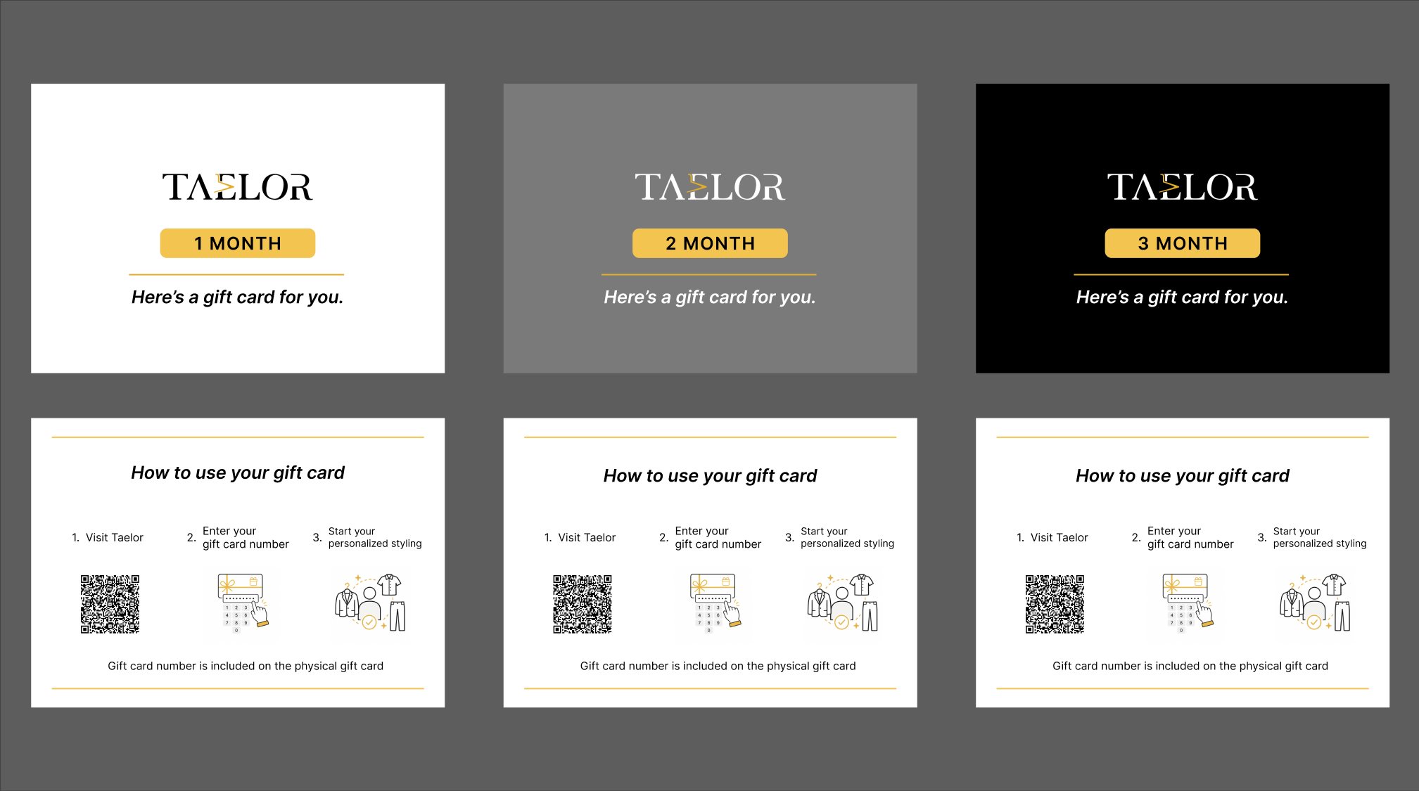
- Designed the printed cards and the "How to use your gift card" insert.
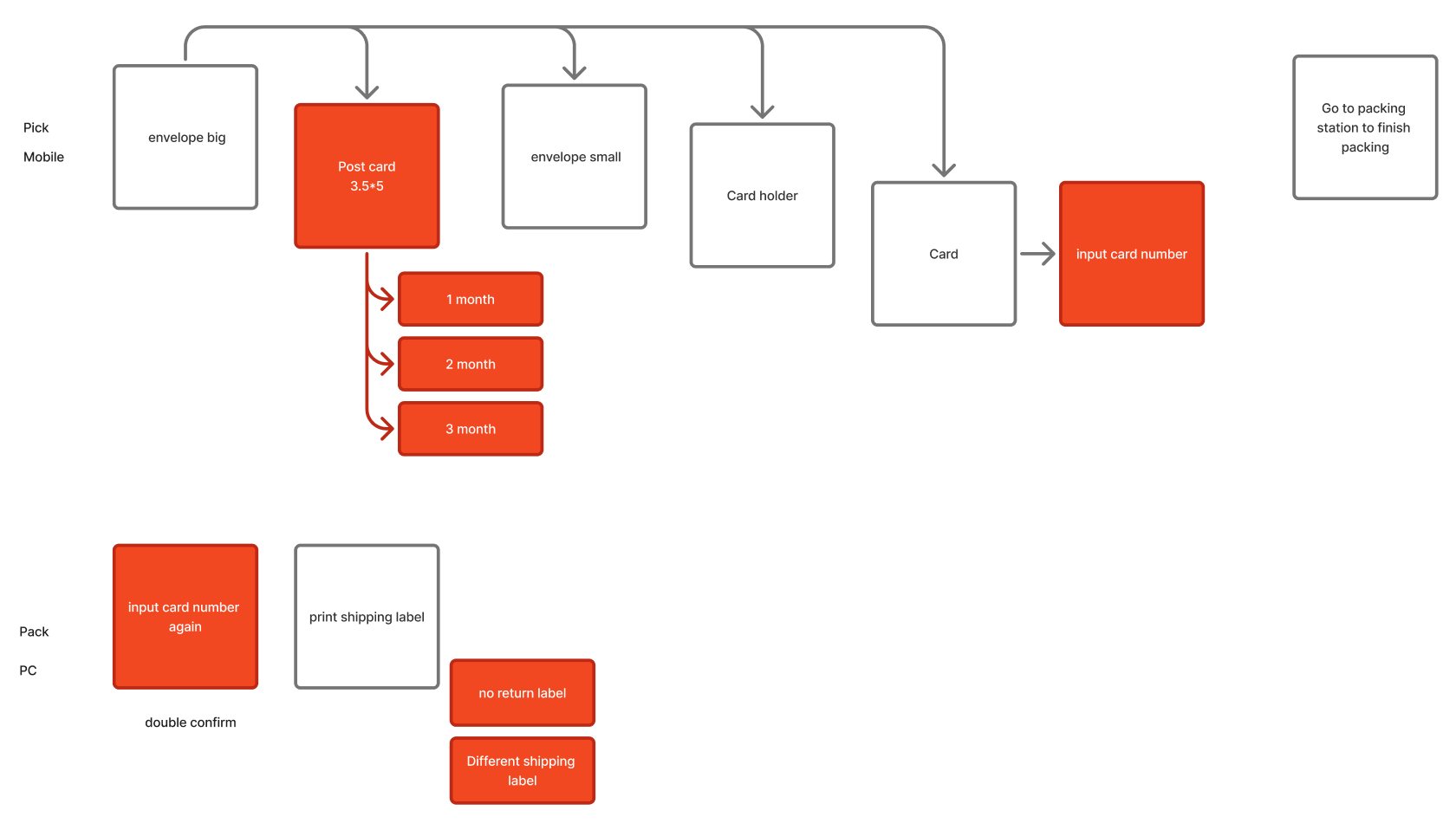
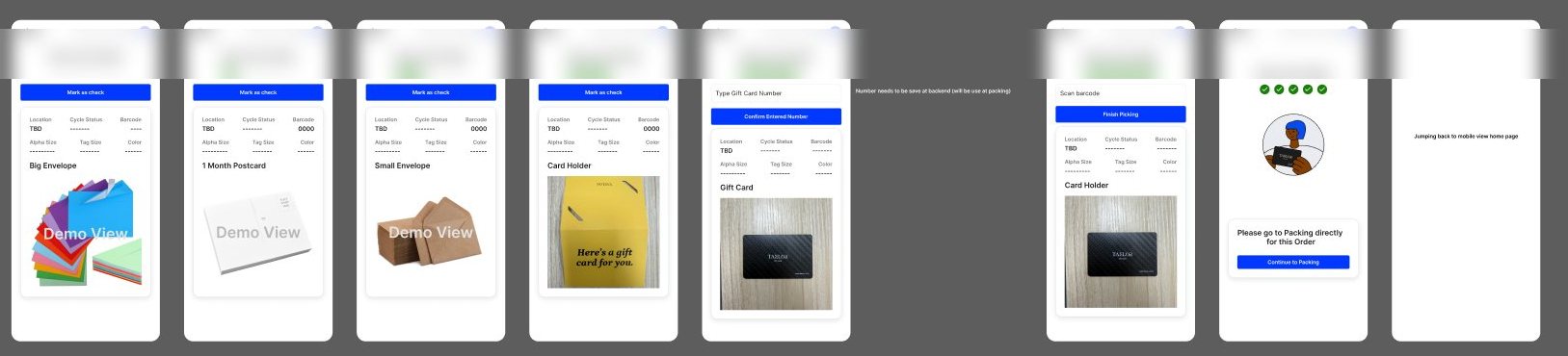
The double check
A gift card number is typed twice by two people. A mismatch stops the order before it ships.
Website
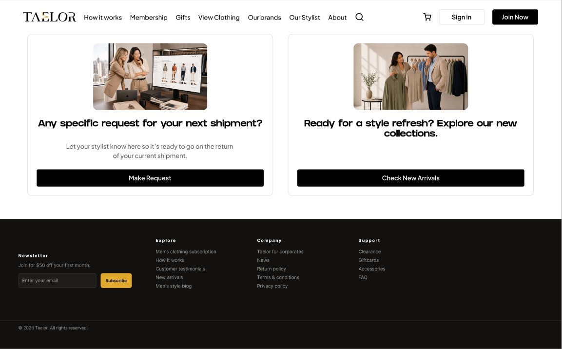
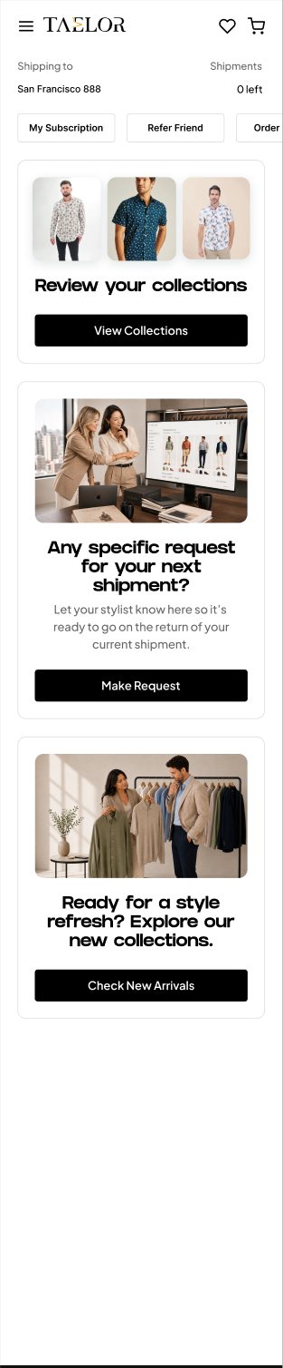
A subscriber homepage with clear next steps
Each card is one thing a subscriber can do next: review a collection, make a request for the next shipment, or browse new arrivals.
Unboxing
What a new customer sees in the box
The sticker now says two things in large type. The flyer explains the service in four steps, with a QR code for each action.
Marketing
Ads and social posts
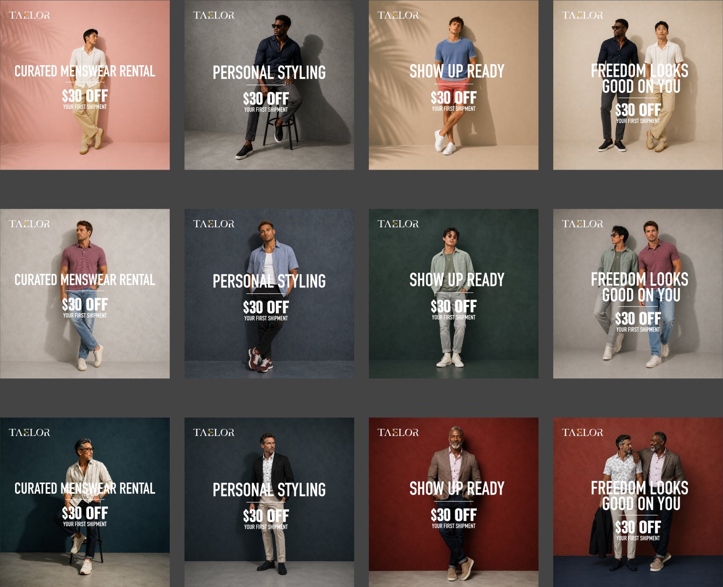
Large type, few words and one clear offer worked best in ads. Social posts moved toward a lifestyle feeling.

5. Reflection
Still shipping
What I took away
- Use the product as a customer before designing for it.
- Rank problems by risk, so the team knows what to fix first.
- Fewer words and one clear action, on a page, a sticker or an ad.
In progress
- Redesign of the My Style Board page.
- The new customer onboarding journey.
- Customer testimonial text messages.
See next project
Industrious
Research-driven strategy for how people connect in shared coworking spaces.